
Our branding, identity and logos explained

Butterflies play a number of important roles in the ecosystem and from ancient times, the remarkable metamorphosis from chrysalis to butterfly has been used to illustrate rebirth and transformation. The Harvest Energy butterfly logo represents the continuous, steady evolution of the business and enhances its environmental credentials.
The Breeze logo depicts two leaves, used in different colourways – blue and green – representing the synergies between the brand and Harvest Energy. The leaves suggest a connection to nature and the environment, while the simplicity of the Breeze logo represents the ease and efficiency of using our facilities.
The clarity and simplicity of the OIL! logo represents the comprehensive service offered at the brand’s forecourts. The logo’s use of green represents the environmentally conscious values that are at the heart of the business, while the use of violet reflects the changing colour of the sky at night – indicative of a commitment to service excellence 24/7. The interplay between the two colours is symbolic of a fuel tank being filled up, highlighting our clear focus on serving the needs of our customers. Meanwhile, the exclamation mark symbolises our dynamic approach to changing needs in the regions in which we operate.
Know Our Company
We have a set of core values which we believe form the basis of our business and which act as a code of conduct for us all, as we go about our working lives. Our core values are as follows:
Where We Operate
Harvest Energy is a member of the Prax Group of companies. The Group’s headquarters are located in London, England, with additional offices and assets strategically located across the UK. Globally, the Group has main offices in Singapore and Houston, as well as additional offices situated worldwide.
Integrated Supply & Optimisation
The Prax Group specialises in the integrated supply and optimisation of crude oil and a wide range of petroleum products, including diesel, fuel oil, gas, gasoline, gasoline components, Jet A1, Avgas and bio-fuels.
Outlets
The Group distributes its products through a global supply network, serving its customers in the retail, aviation, wholesale, fuel card, marine, haulage and government sectors.
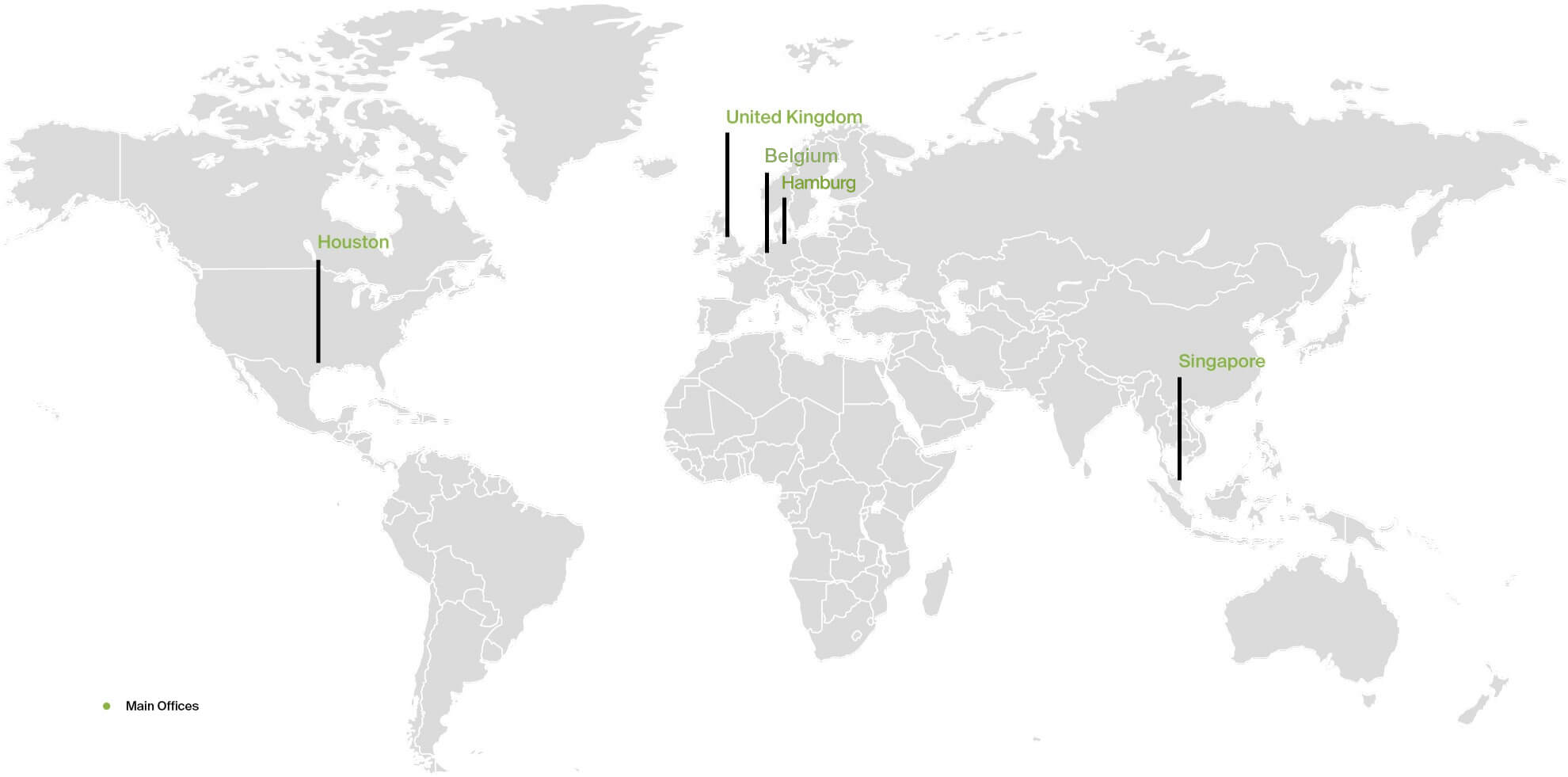
London, England – Prax Group Headquarters and Office for Europe & Africa; Weybridge, England – Office for Harvest Energy; Lincolnshire, England – Prax Lindsey Oil Refinery; Aberdeen, Scotland – Office for Exploration & Production
Houston, Texas – Office for the Americas
Singapore – Office for Middle East & Asia
Antwerp – Office for Harvest Energy Marine
Hamburg – Office for OIL!